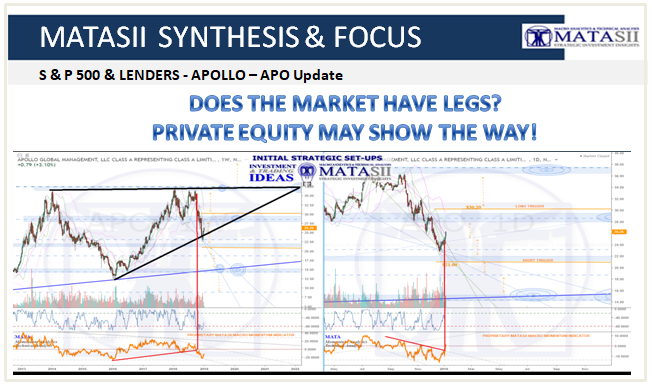
DOES THE MARKET HAVE LEGS? PRIVATE EQUITY MAY SHOW THE WAY!
The market is reacting to late-cycle expectations in the Credit Markets. Widening HY Spreads, investors pulling money from Leveraged Loans and CLO (Collateralized Loan Obligations) worries of an IG "BBB" downgrade wave all are weighing heavily on the credit market and increasing market volatility.
Our eyes are on key players in the shadow banking sector who create credit and push it via various means. To us they tell us where the equity markets are headed. One sub sector we carefully examine is Private Equity. The top four US PE firms have over $1T in assets alone. This is up dramatically in the last 10 years with the total Private Equity now in excess of #10T. This is major firepower! We recently explored this and shrinking stock pools in our video "Understanding the Disappearing Stock Float".
The Private Equity players have a profound impact on market movements today in many ways including their participation in the credit creation process of CLO's and Leveraged Loans in the leveraging & gearing of Corporate balance sheets. One player's chart to watch is Apollo Global Management.
APOLLO GLOBAL MANAGEMENT
Here is our near term Technical chart and analysis of APO (Weekly and Daily Charts) along with our proprietary MATA Momentum Indicator. The key Trigger levels (in orange) show you what we are currently watching.
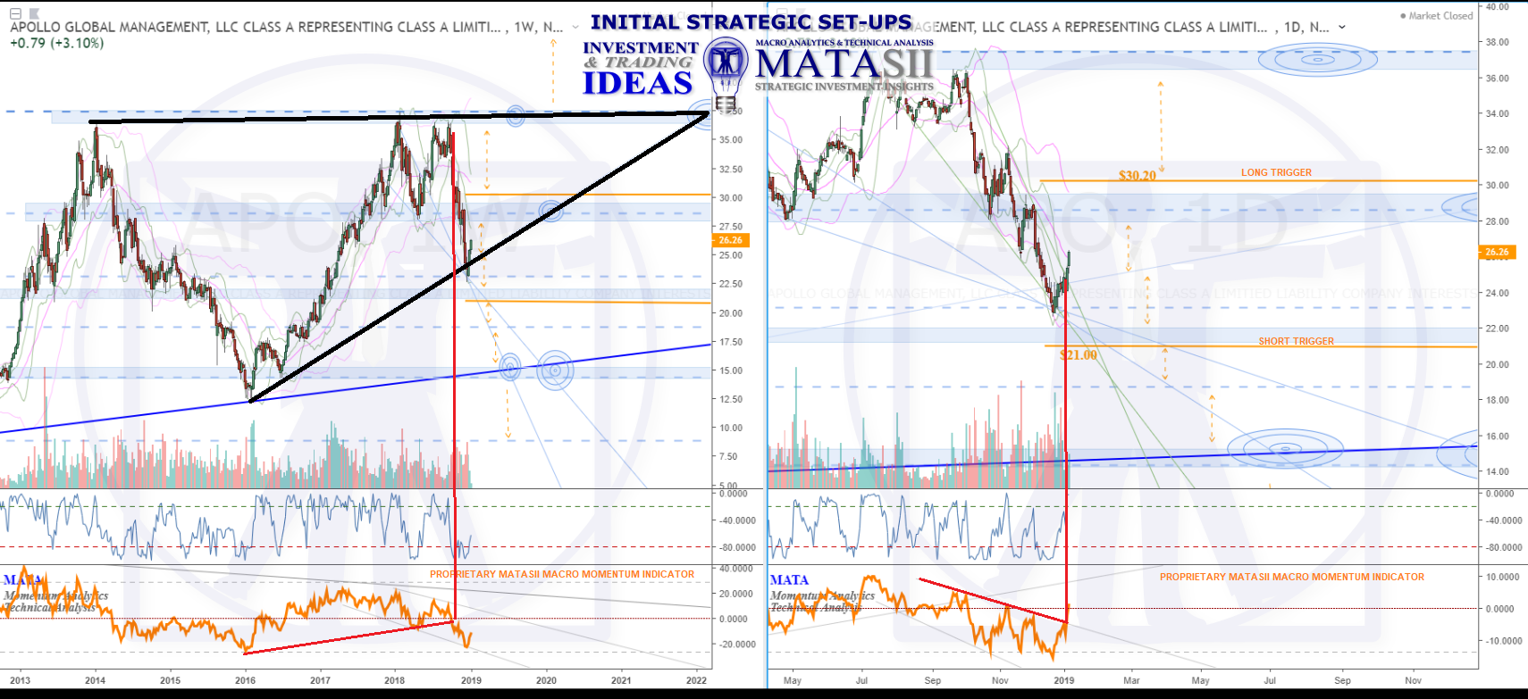
The long term weekly perspective (left chart) has had the market in a contracting wedge since 2011 (in black), with the last significant low lifting from the wedges support in 2016. The top of the pattern and resistance held in Jan.2018, with the market consolidating and then dropping off significantly as of Sept.2018. Bouncing at support at the end of Dec.2018, the market currently sits about 1/2 way within the larger overall wedge pattern.
Also important to note are the significant Fibonacci levels (blue dashed lines) and s/r zones. We can see that the market has reacted to and ranged between them fairly consistently. While the past is no guarantee of the future, they do give us places to watch for market reactions, as well as a road map for potential future expectations.
For example, the $21.00 level has been highlighted in orange and sits just below the next blue s/r zone below the market. IF the market continues to fall off, then dropping through this technical trigger consideration could then see the market move to the Fibonacci level below, and potentially longer term back to the support of the larger wedge pattern.
Or, IF the recent bounce continues and the market lifts, breaking up above the next blue s/r zone and the orange highlighted level at $30.20 could then see further lift and a move back to the highs or the top of the larger wedge pattern. Important note: the $30.20 marks the price level, however the pink ma that can be seen falling towards the highlighted level on the weekly chart ALSO needs to be moved over. IF the market lifts to the orange highlighted level, then the pink ma will have also dropped, likely the two will be close by each other - ultimately it is a lift over and support from the pink ma that we would like to see, not just a break of the price level.
Orange dashed arrows highlight potential moves from one technical to the next. Again, if we look to the left on the weekly chart we can see that the market has previously reacted to and moved between these. These charts offer potential technical road maps for consideration, how you plan your trip however, is up to you. These are meant as a guide to facilitate trading and investing plans - the charts are not a trading plan in and of their own. Your own style (long, short term), entry & exit strategies, risk tolerances, stop levels and considerations (technical or trailing, or?) etc. - the charts offer you a guide to plan all that out on; they are not meant to be trading/investment recommendations or plans themselves.
In general, APO sits about 1/2 way within a large contracting wedge pattern. At this time, equal opportunity exits for a move in either direction - following the technicals as it moves can offer some potential guidance for what may come next.
LONGER TERM
What is very interesting is how this chart compares to the Longer Term S&P 500 Fibonacci chart (below). We recently posted a detailed analysis of the S&P 500 here at Seeking Alpha - Preparing For The Fed's Capitulation Signal And A 2019 'Right Shoulder' which included this chart as part of an Elliott Wave analysis. Notice the 3060 level in 2022 as the final level of this secular Bull Market. Our "Black Wedge" above for Apollo coincidentially terminates at the same point. Therefore we are watching our Apollo "Trigger" levels closely.
