
IN-DEPTH: TRANSCRIPTION - LONGWave - FEBRUARY - Beware of Cascading Fractals
SLIDE DECK
TRANSCRIPTION


COVER
Thank you for joining me. I'm Gord Long.
A REMINDER BEFORE WE BEGIN: DO NO NOT TRADE FROM ANY OF THESE SLIDES - they are COMMENTARY for educational and discussions purposes ONLY.
Always consult a professional financial advisor before making any investment decisions.
AGENDA
In prior LONGWave videos we have discussed what we identified as major Megaphone pattern formations at various degrees of price and time. We are reaching the termination of the larger degree Megaphone pattern and therefore I thought it important to revisit what that may mean.
I also want to do this in the context of some other observations as outlined here.
SLIDE 5
You have seen this schematic before on how we analyze markets in ‘marrying up’ Market drivers such as Sentiment, Risk and Fundamentals with Longer Term Macroeconomics. In this session we are going to bridge the two from a technical perspective.
We see the potential for a SHOCK to soon hit the markets.
SLIDE 6
We are showing here what we see as a very large degree Megaphone pattern in the S&P 500 that started with the peak of the Dotcom Bubble in March of 2000.
The Blue (B) was the bottom of the 2008 Financial Crisis. We appear to be nearing a culmination of that pattern.
This Megaphone Pattern has been showing itself as a fractal pattern at ever smaller degrees.
The Red megaphone pattern shown here and labeled (C), (D) (E) is the next smaller degree.
SLIDE 7
That degree for the S&P 500 is exploded here. It started at the beginning of 2018.
It has been our experience that repeating smaller degrees of a pattern or fractals is a very reliable technical indicator of what might lie ahead.
If that is the case we should be able to identify further patterns if we drill down.
SLIDE 8
I am showing here the price action we have seen in the S&P 500 since last September up until about a week ago.
I have shown some annotations (in green) we were tracking at the time concerning the current level the CTA Gamma Traders strike price. It has since moved up to north of 3900 on the S&P 500 and around 1.15 to 1.18% rates on the 10Y US Treasury Note. We will come back to that later.
SLIDE 9
I have laid in two trend lines in white that show we have a potential ending diagonal emerging.
An Ending Diagonal is also another fairly reliable technical indicator.
SLIDE 10
Connecting more lows and highs within the pattern we see a converging area emerging.
SLIDE 11
The labeling as shown here illustrates that we have the labeling of the megaphone pattern which also exhibits an A, B, C, D, E count.
SLIDE 12
It appears that this ending diagonal will end in the time frame that correlates with the February Options Expiration.
This doesn’t come as any surprise to those that watch charts on a regular basis.
SLIDE 13
What jumps out of this chart is we once again have another Megaphone Fractal identified in the white box.
It may not be obvious because of the trend but if we show the same price action with an orthogonal representation it become clear.
SLIDE 14
This is the same period with the same price action updated as of Monday close February 8th.
This is exactly what we would expect from our years of watching such Fractal patterns.
The Fractals tell us to beware of a potential market corrective/ consolidation developing that will be of a large Price/Time degree.
Let’s shift gears and see if we can put some framework what that consolidation / correction may be?
SLIDE 15
The following charts appear busy so we will only focus on some key points that they individually suggest.
This chart of the S&P 500 going back to the bottom of the Financial Crisis shows a maze of Fibonacci Support and Resistance levels. The dotted red line shows a potential parabolic blow-off top for the markets that we felt was underway over the next 5 years before the March 2020 Covid-19 driven market sell-off,.
The solid red line shows that parabolic sell-off adjusted for the Covid-19 market shock.
The analytics behind this chart is suggesting an S&P 500 low of 3270 sometime in the summer of next year.
SLIDE 16
However corrective / consolidation ranges can form many structural patterns, none of which we, at least, can determine in advance.
Therefore we start with maximum conditions for the range and by process of elimination going forward we narrow down those possible patterns.
We therefore show here a double bottom in the range and a double top. The double top would convince we are heading seriously lower than this chart indicates while the double bottom or “W” pattern is typically of an important bottom.
Also we often have corrective legs that mirror the last leg up but in reverse.
Therefore we arrive at a starting expectation of an initial bottom at a price of 3270 in the summer of this year and a retest of the 3270 a year later. This is also an interesting correlation as it is quite normal to see important markers tested a year later.
So at this point we will simply consider our market marker to be 3270 sometime this summer.
SLIDE 17
This is another long term analysis of the S&P 500 using 12 and 24 MMA’s
We see that the current market activity may in fact be a “throw over” that often occurs prior to market corrective / consolidations and reversions to the mean.
It is interesting that our 3270 market (shown in blue here with a red circle) lies at the channels mid-point and in-line with where the 24 MMA is likely to be at that point.
SLIDE 18
This is the same S&P 500 monthly chart but uses a log scale so we are viewing a better representation of percentage moves.
A band of long term moving averages we use shows relatively hard support around a mean reversion that centers around our 3270 price and time marker.
Nothing is a guarantee in markets, but what we have found is that probabilities of success go up with the higher number of correlations you have working for you.
One of the reasons is that today the market is almost solely driven by algos. They may all use different algorithms but these algorithms all use many common market benchmarks and correlations.
SLIDE 19
I am switching here to weekly charts and using 20-40-80 WMA’s. The indicators at the bottom show an over extended market while the colored bands surrounding the S&P 500 price action as being very orderly and managed.
It is also signaling that a support test of the MA’s is overdue.
We have again placed our 3270 market marker. It appears to align with where we might expect the 80 WMA to be during a possible move down over by this summer?
SLIDE 20
This is the same weekly chart drilled down a little and using different moving averages.
We are using much larger 50-100-200 WMA.
The message here is that the longer term WMA s would exhibit a much more normal set of profiles if we had a price correction towards our market marker. It would center these MA’s that would be tighter by then.
Regression to Moving Averages is another high probability technical analysis understanding.
SLIDE 21
Finally if we look at a daily price action chart of the S&P 500 we see our 3270 market marker exhibiting the potential for a very standard ABC correction towards 3270.
It will be interesting to see how our roadmap unfolds!
SLIDE 22
Again switching gears we need to consider what would trigger a reversal in trend in the near term? What would be the trigger or catalyst?
We can never be certain but most times it quite evident after the fact.
What is very evident right now is the level of margin debt to the size of the economy.
Normalizing margin debt by the size of the economy we see we are well above anything we have ever experienced. Everyone is on the same side of the boat.
SLIDE 23
But it is even worse than that. If we historically look at 9 month increases in the total margin debt we not only see this record rate but each time we have experienced this level of margin spike we have experienced a corrective / consolidation.
SLIDE 24
Interest rates are also rising and are breaking important overhead resistance.
The 10Y UST Note is now trading between 1.15 and 1.20. This places margin funding costs in peril!
Inflation as we have been pointing out in our recent newsletters is showing itself across the board and around the world.
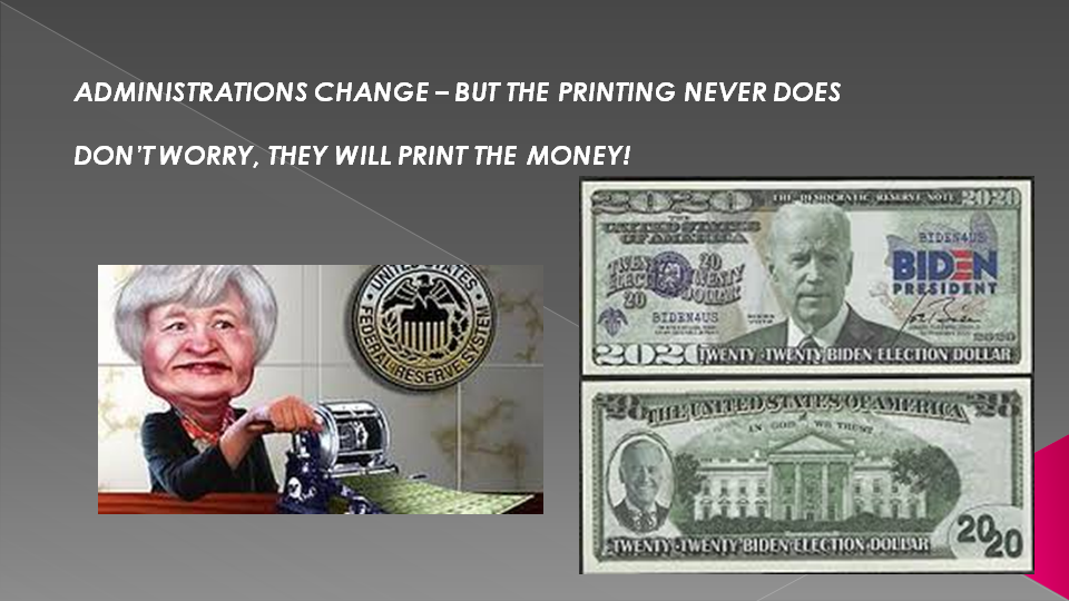
SLIDE 25
The Fed has committed to buying $120 BILLION worth of assets PER MONTH for the foreseeable future. This means the Fed will be printing upwards of $1.4 TRILLION per year going forward.
That’s roughly the size Russia’s GDP (the 11th largest country in the world).
The Fed’s not the only one pushing for staggering amounts of money printing either.
The Biden Administration will soon sign off on a $1.9 trillion stimulus program. It has also proposed a $2 trillion infrastructure program, as well as a $1.7 trillion climate change program.
That’s an additional $4.7 TRILLION in money printing on top of what the Fed is already doing ($1.4 trillion per year).
All of this is going to unleash an inflationary storm, the likes of which we have not seen in decades.
And the markets know it.
Take a look at what the ratio between Treasuries that trade based on inflation vs. normal Treasuries is telling us.
You’re looking at a 10+ year deflationary downtrend ENDING as inflation begins to rip through the financial system. In the simplest of terms, this chart represents the bond market SCREAMING, “INFLATION IS ABOUT TO HIT.”
SLIDE 26
As I pointed out in my last newsletter the increase in inflation has some suggesting that further stimulus may be deferred.
SLIDE 27
The problem is the market is riding the wave of Global Liquidity. Anything that even suggests a slower rate would be a market shock.
As you can see we are aleady experiencing a deviation between the global liquidity proxy and the S&P 500 (in the top right corner).
The boxes show what happened the last tome this occurred!
SLIDE 28
It isn’t like there is any money on the sidelines to fill any disruption in liquidity pumping. Mutual Fund Cash levels are at historic lows.
Frankly, this has the potential of seeing “flash crashes”! Who is going to be there to buy?
We have yet to fully experience the downside of the shift to Passive investing in broad market ETF’s when nervous investors hit the “sell” button on their PC’s.
Now that would be a shock even the central banks couldn’t stop!
SLIDE 29
I will close with this chart comparing the post Financial Crisis lift, as we pumped liquidity, with that we have seen lately.
Markets simple don’t go straight up without stopping occasionally to catch their breath!
SLIDE 30
As I always remind you in these videos, remember politicians and Central Banks will print the money to solve any and all problems, until such time as no one will take the money or it is of no value.
That day is still in the future so take advantage of the opportunities as they currently exist.
Investing is always easier when you know with relative certainty how the powers to be will react. Your chances of success go up dramatically.
The powers to be are now effectively trapped by policies of fiat currencies, unsound money, political polarization and global policy paralysis.
SLIDE 31
I would like take a moment as a reminder
DO NO NOT TRADE FROM ANY OF THESE SLIDES - they are for educational and discussions purposes ONLY.
As negative as these comments often are, there has seldom been a better time for investing. However, it requires careful analysis and not following what have traditionally been the true and tried approaches.
Do your reading and make sure you have a knowledgeable and well informed financial advisor.
So until we talk again, may 2021 turn out to be an outstanding investment year for you and your family.
Thank you for listening