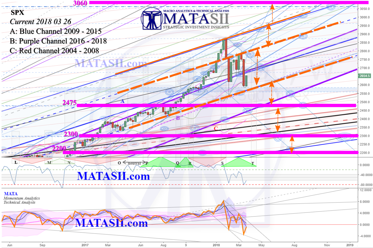
Last update we gave you this chart, identifying significant technical supports, resistances, and levels.
Here is the current view of the same chart.
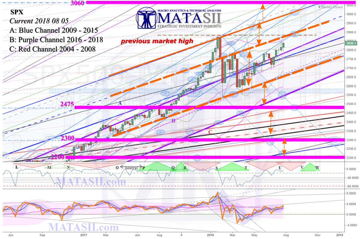
The market has lifted, remaining within the two orange dashed highlighted technicals. No significant changes or moves occurred, this chart remains valid and we continue to watch it.
Note the addition of the "previous market high", identified with a red dashed highlight. The market is approach this, as well as an orange dashed highlight and a potential HPTZ target. Regardless if the market reaches the target or not, we are watching to see the reaction at the highlighted technicals.
MATA Indicator: Looking at the first chart (previous update) we can see a blue channel in the price/time area from the drop off the highs, with the last two highs and the previous low touching the channel s/r's (support & resistance trend lines). If we then look to the bottom indicator (MATA), we can see a corresponding grey channel identifying the same thing.
Now look at the price/time chart's current update (2nd chart) and note the market bounces off the orange dashed highlight, and then breaks up through the blue channels resistance (at a HPTZ target) in the week of May 7th/2018. If we look at the MATA Indicator, we can see that it broke out of it's grey channel in the week of April 16th, 2018. The indicator breaks from it's grey channel and moves along the red -0- line; and not until it lifts up to the previous trend line s/r do we see a break in the price/time area of it's blue channel. Several weeks prior to price breaking from its down channel, the MATA Idicator broke from it's momentum channel, warning of a possible trend change.
This exemplifies the theory behind our MATA Indicator: that shifts in momentum can warn of trend changes in price.
Further Analysis:
We will now drop down to the daily chart and take a closer look at the current set-up. The chart below is from the updated S&P500 DAILY Basic chart linked to on the site.
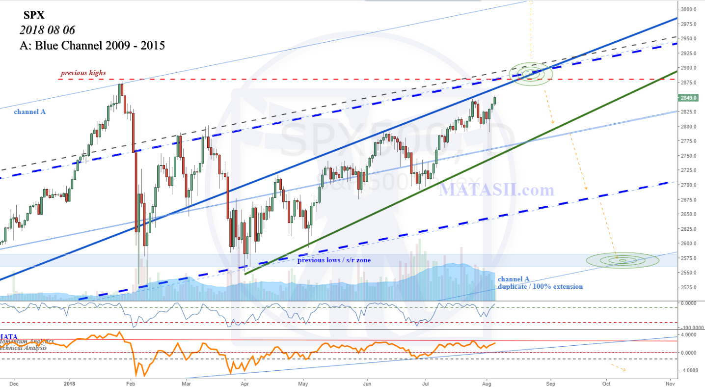 The two bright blue dashed trend lines are what we see highlighted with orange dashed lines in the charts above. The top blue dashed line is actually the mid-point or 50% of Channel A that originates from 2009 - 2015. When we duplicate Channel A, or extend it 100%, the lower blue dashed line is the mid-point or 50% of the duplicate / extension. The lower channel support of the channel duplicate or 100% extension can be seen in the bottom right of the chart; and along with the weekly s/r zone offers a potential target for consideration.
Potential Significant Move Pending: Technically, a significant move, up or down, can be seen as a very real possibility.
IF the market breaks up through previous highs and the technicals that can be seen just above the current market, then we could see a continuation of the previous up trend, prior to the fall off that started at the end of Jan this year. What is interesting about the lift is that, if it continues as it has, it is starting to take on a curved shape. This is still just potentially beginning, but if it unfolds it means that we can expect the lift up to increase in velocity - the trend will continue to steepen as it lifts.
IF the market holds at previous highs or the technicals that can be seen just above the market, then the next down move could be similar to the last two significant drops that can be seen starting Jan 29th and March 13th. These represent moves coming in to the current pattern: equal moves after the pattern completes is a common technical projection. Or A = C.
The market is nearing a potentially significant technical junction, and a break or hold here could see a volatile next wave, up or down.