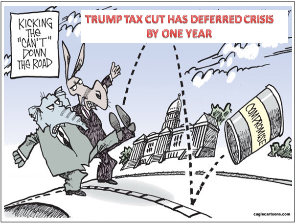
TRUMP TAX CUT HAS LIKELY DEFERRED CRISIS BY ONE YEAR
I have selected some excellent charts from the work of Lance Roberts, who I hold in high regard. However, sometimes we interpret the same facts in a different fashion based on our experience.
Even if all our facts are correct, our conclusions may be completely wrong.
To illustrate our point, there is a story Abraham Lincoln used to persuade juries when he was an Illinois circuit court lawyer.
The story goes that Lawyer Lincoln was worried he had not convinced the jury during the closing argument of a civil case against a railroad. The jurors had gone to lunch to deliberate. Lincoln followed them and interrupted their dessert with a story about a farmer’s son gripped by panic,
“Pa, Pa, the hired man and sis are in the hay mow and she’s lifting up her skirt and he’s letting down his pants and they’re afixin’ to pee on the hay.”
“Son, you got your facts absolutely right, but you’re drawing the wrong conclusion.”
The jury ruled in Lincoln’s favor.
Lance's first chart illustrates the relationship of the RSI Indicator in identifying major market reversals. Our view is slightly different and tells us we are likely still in the early stages of a major topping process. If you examine the behavior of the RSI prior to prior tops you see that often there are 3-4 peaks relatively well in advance.

We therefore annotated Lance's chart to possibly better reflect this expected pattern. It importantly suggests the market top (possibly a Head & Shoulders) is still in front of us or we may already have seen the top (with alternatively a double top coming), but whatever the final top (including our long projected "M" top) we still have a strong probability of more to go throughout 2018. We should not forget that major market tops are a process!
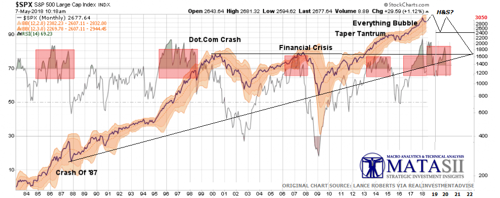
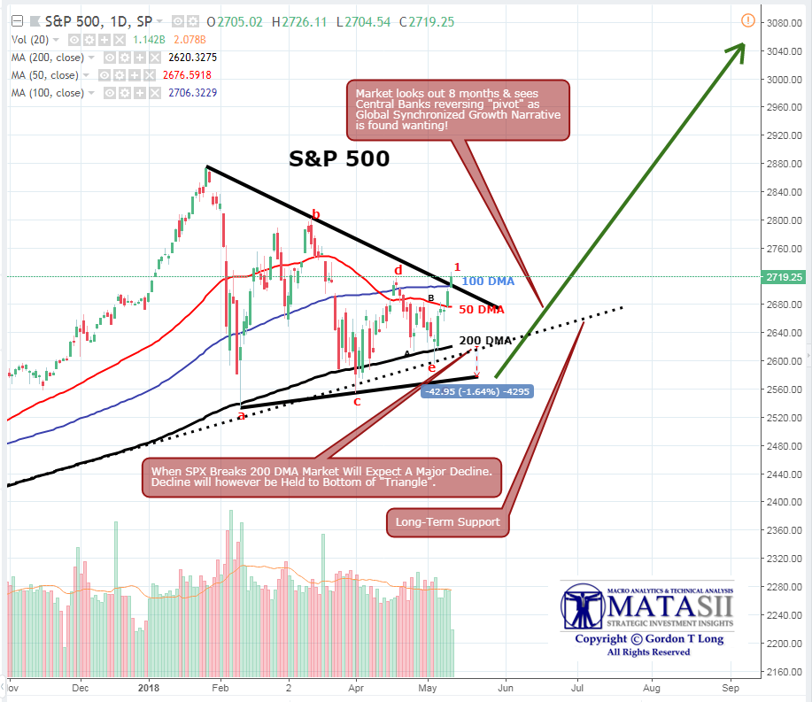
The following chart shows the triangle pattern we have been tracking at MATASII for both the S&P 500 and DJIA. A live annotated chart can be found by clicking here: DJIA. The triangle is a high probability "continuation" pattern. This suggests that the trend going into the triangle formation which was up, will continue after the pattern is completed. Lance's work shows 8% to ~2850. Our work suggests a Fibonacci target at ~3050.
The -10.2% drop however needs to be heeded for two reasons.
- This is the perceived Fed "Put" for the market. Approximately 2300-2400 on the S&P 500,
- Technical this is important longer term support that will eventually be broken (See below).

MATASII'S MORE DETAILED VIEW (BELOW)
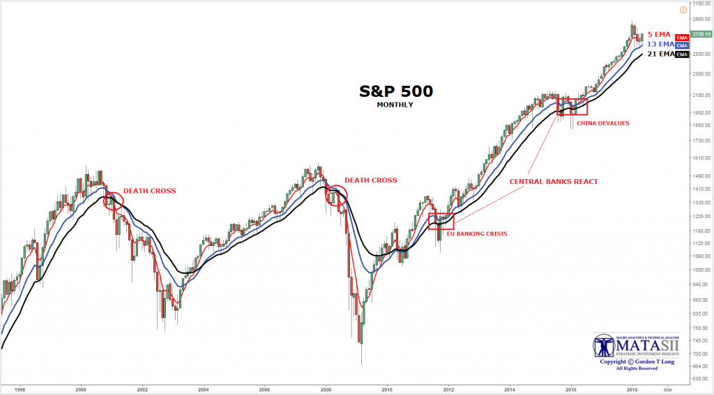
Like Lance Roberts we believe that the Primary Indicator is found on longer term charts. We use monthly charts and the 5,13 & 21 EMA for this work but Lance uses Weekly charts with a Long-Term Moving Average (shown in green). He identifies the current level of that MA at 2400, the same as the level identified above. Again our interpretation is subtly different:

- The Moving Average is flat to turning down before the big move down occurs. It takes a protracted period of time with the markets relatively "confused" to allow the long term MA to exhibit this.
- Price action can be expected to test this level at some point during the topping process and bounce off it or break through and then retest the underside. This process is therefore more about time.
- Our second chart above annotates where we feel this activity has a probability have fitting.
- MATASII's use of the faster moving Exponential Moving Average and shorter term 5 & 13 EMA's on Monthly charts can be found at MATASII which allows the identification of critical timing "Death Crosses" to be identified early during this process.
One final, excellent chart from Lance Roberts is shown below. This derivation of Shiller's CAPE using the a 5 Year Cyclically Adjusted P/E Ratio shows how it has become a usable "Leading" Indicator. A couple of important observations need to be noted:
- Major drops in the 5-Year Cyclically Adjusted P/E can be seen to occur prior to markets fully capitulating.
- A major drop in this forward P/E ratio is going to be difficult with Trump's Tax cut giving strong quarterly comparison numbers throughout 2018. However, 2019 will suffer because of exactly that!

.... and almost every analyst making 2019 predictions forecasts exactly that drop occurring in 2019.
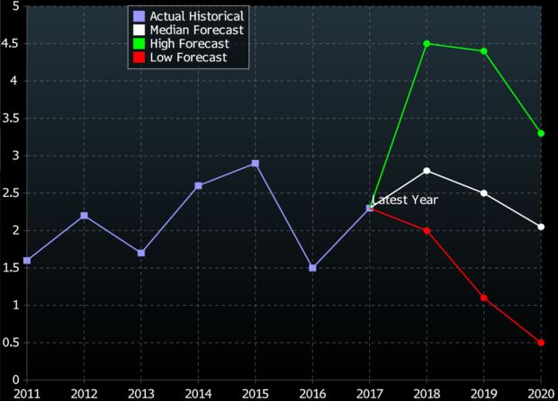
Despite record earnings so far in 2018 they all recognize that 70% of earnings growth this year has been & will be driven by one time only tax cuts.
Consider this data courtesy of FactSet:
- Earnings expectations for the S&P 500 have risen by 8.8% for 2018 since the start of the year. The point estimate in early January was $147/share; now it is $160/share.
- Estimates for 2019 are up 8.6%, from $162/share to $176/share since the start of this year.
Wall Street earnings estimates have essentially come forward by an entire year in the last four months. Where analysts had $162/share for 2019 back in January, they now have $160/share for 2018.
Thank you President Trump for another year to prepare for what is certain to be coming.