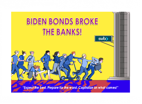
IN-DEPTH: TRANSCRIPTION - UnderTheLens - 03-22-23 - APRIL – Biden Bonds Broke the Banks!
SLIDE DECK
TRANSCRIPTION
SLIDE 2
Thank you for joining me. I'm Gord Long.
A REMINDER BEFORE WE BEGIN: DO NO NOT TRADE FROM ANY OF THESE SLIDES - they are COMMENTARY for educational and discussion purposes ONLY.
Always consult a professional financial advisor before making any investment decisions.
SLIDE 3
Milton Friedman was an American economist and statistician who received the 1976 Nobel Memorial Prize in Economic Sciences for his research on consumption analysis, monetary history and theory and the complexity of stabilization policy. These are all core issues in today’s economic environment.
In a talk he gave in India in 1963. He made the quote shown here very famous:
“Inflation is always and everywhere a monetary phenomenon.”
In the most fundamental sense this statement is accurate. However, even Friedman was very specific in further clarifying, he added he was referring to “episodes of persistent inflation”, since in the short run, supply shocks can also impact the price level.
Frankly, I think today his clarification is as important as his foundational Austrian Economic statement.
We have experienced inflation initially driven by Covid-19 related Supply Chain shocks. However, that element has mostly reset.
What we have been experiencing since 2021 is the direct result of his heralded research conclusion!
This is primarily what I want to discuss this session.
COVER
We are in the midst of a major banking crisis!
I believe it is a direct result of Friedman’s famous quote! The net of the current banking crisis is:
1 - Biden’s Historic level of Spending, which lead to
=> 2 – Monetary Driven Inflation, which resulted in
=> 3 - Exploding Yields, which caused
=> 4 - The Instability of the Banks' Core Stabilizing Asset
Since the post WWII Bretton Woods conference, the US Treasury Bonds (specifically the 10Y UST) have been the global Risk Free interest rate benchmark.
This requires that it be maintained by responsible economic and fiscal policy management.
The global Basel Bank Accords were built on this which resulted in the US Government Treasuries being a core block in establishing:
- Value-at-Risk (VaR) Metrics,
- Capital adequacy Ratios, and
- Regulatory Lending Ratios.
However, the Biden administration's $6 - $7.6 TRILLION spending shock since 2021 has resulted in:
- The $1.9T American Rescue Plan projected to realistically involve $3.5T in total spending,
- The $740B Inflation Reduction Act,
- The $1.2 Trillion Infrastructure Bill,
- The $280B CHIPS Bill,
- The $200B of Ukraine Military Support,
- The January $1.7T Omnibus Bill
Then in addition we the new expanded $6.8 TRILLION budget submission which was released the day before the banking crisis kicked off. All of this has simply been just too much for the banking sector to juggle before the carefully constructed stability metrics simply started "tilting" out of balance!
SLIDE 5
In this context I want to cover the items outlined here
SLIDE 6
We all knew the Fed was going to break something before it stopped raising rates.
The history of Fed policy has demonstrated that, almost without exception! I have shown this graphic before in the way of warning many times in my videos and newsletters. I particularly liked this version by Lance Roberts of Real Investment Advice because he uses an exponential trend with corresponding supporting bands.
It is as good as any in graphically explaining why the Fed has been able to get the Fed Funds Rate as high as it has without not having broken something earlier! It is higher than the linear trend lines had suggested.
SLIDE 7
But the Fed has now clearly broken something, and as a result immediately rolled out the “Bank Terminal Funding Program” (BTFP) Facility.
What can only be called its panic adoption has already effectively removed a significant amount of what had been achieved by Quantitative Tightening (QT) in reducing the Federal Reserve’s Balance Sheet!
This is a major liquidity injection which is effectively returning to Quantitative Easing (QE) in a stealth fashion without buying US Treasury Bonds and Mortgage Backed Securities (MBS).
SLIDE 8
As most are aware the rise in US equity markets since the 2008 Financial Crisis has almost mirrored perfectly the growth in the Federal Reserve Bank’s Balance Sheet.
We had some divergence prior to the Covid-19 as the Fed tried again to wean the markets off it’s’ addiction to liquidity injections, but that failed and was thrown aside with Covid-19.
I sincerely caution everyone in believing this may mean we are off to the races again as the Fed capitulates on its rate hikes and is forced to begin taking them back down.
SLIDE 9
Always the best technical guide to what the Fed will do is the actions of the 2Y Treasury note. It has abruptly plummeted in the last week in reaction to the unfolding banking crisis and suggests that pressures will be on the Fed to at least temporarily hold further Fed Fund Rate increases.
The March FOMC announcement in this regard will be interpreted with unknowable conclusions. I think we will show as we go through the charts that the Fed is trapped and if history is any indication they will follow the patterns they have in prior similar situations. Yes as you will see the Fed has been in this type of situation before and we will show you what it did each time.
SLIDE 10
The wild card is the degree to which the banking sector has been destabilized globally.
The degree is yet unknowable. However, it is pretty certain we are closer to the beginning than the end as we have smashed through major support levels.
As the proprietary MATASII Momentum indicator in the bottom pane shows here, we haven’t seen this level of momentum breakage since the Global Covid-19 shock! As a consequence we should expect unintended consequences, collateral damage and further breakage.
SLIDE 11
The Fed is trapped because inflation hasn’t come down fast enough versus the levels it has been increasing the Fed Fund Rate to. This gap is major!
Without getting rates above the inflation rates we will further lose control of inflation even more than we presently have!
The Fed can’t drop rates without losing the complete confidence of the financial markets, which would result in spiking yields and a weakening dollar. Both would only compound the precarious position they are already in.
SLIDE 12
The Fed must get the rate by which is still increasing on a month over month basis down to 0% from 0.4%. Presently that is a 4% annualized rate. The Year-over-Year rate must be lowered below the historically problematic 5% level we outlined in this year’s Thesis paper. Anything less on either metric or “Sticky” inflation will likely only surge further - - if history is any indication.
SLIDE 13
What is it that the Fed sees that the public may not? One is how the markets reacted to its’ policy during the 2008 crisis.
SLIDE 14
I have expanded the chart on the Fed balance sheet correlation I showed earlier to include 2008 highlighted in the bottom left corner.
What is surprising then (and easily forgotten) is that when the Fed did start to increase its balance sheet in reaction to rapidly falling markets the market reacted differently than we currently would expect. The equity markets only continued to fall further despite the aggressive fed liquidity injections! Note the crossing pattern!
What the markets were saying is that “structurally” matters were worsening and liquidity was not the solution! Yes it also needed to happen, but it wasn’t the full solution needed. It was now only a bandage, when a major “operation” was required!
When the situation has already advanced too far, then the measures required are both different and often much more dramatic!
SLIDE 15
Is the case now?
Here I have overlaid gold pricing in turquoise onto our chart.
Notice that gold exploded at that point on 2008!
Likewise, notice that gold has spiked recently in the midst of the banking crisis. Yes during risky times there is normally a flight to the safety of gold. No doubt this is at play, but it could be more! Is the market concluding the Fed’s Monetary Policies actually can’t solely fix the problem? Does the market sense there is actually a major structural problem at play?
SLIDE 16
Here, I have overlaid High Yield Spreads onto our chart.
We see that in 2008 that spreads suddenly went ballistic when the Fed started increasing liquidity.
Again on the right, today we are possibly seeing the same reaction about to occur?
SLIDE 17
Besides some trends about to remerge we are also seeing new warnings.
SLIDE 18
Energy and Oil as represented by the WTIC continues to weaken, signaling the expectations of a recession or significant slowdown. Economic weakness normally means layoffs and unemployment which will only build on the attacks Powell received during his recent Humphrey-Hawkins testimony that were quite clear that the politicians have no stomach for rising unemployment going into a tuff Presidential campaign season.
SLIDE 19
The yield curve spread of the 10Y Treasury minus the Fed Funds Rate pushed forward 12 months then overlaid on the yearly percent change of the Coincident Economic Indicators is supporting the WTIC that an economic slowing is both underway and should be expected to quickly worsen.
SLIDE 20
Though I don’t give a lot of weight to insider buying or selling, the consistent trending behavior suggests, minimally, there is little confidence with those that have inside views of their businesses, industry and economy.
SLIDE 21
We have mentioned this in our weekly newsletters but we have clearly witnessed a shift from the markets tracking to the Fed Balance Sheet liquidity actions so prevalent over the last decade; to markets tracking closely to the volatility of the bond markets through the “MOVE” index.
SLIDE 22
It seems that many indicators have reached levels not seen since prior major crisis periods. These periods often signal major trend changes or significantly worsening existing trends. We suspect it is the later and the market weakening we have witnessed since the beginning of 2022 may be about to get even worse.
SLIDE 23
When we look at the inverse of the MOVE index against equities we see the tracking we have witnessed since the beginning of 2022. However, we recently have seen a major divergence. Either the bond market is about to go to sleep or the market is about to correct quite steeply to close the gap with bond volatility.
This reminds me of the Willie E Coyote cartoon of him going off the cliff without realizing it; and it is about to dawn on him the position he has suddenly found himself in.
My bet is actually that I expect the bond MOVE index about to worsen leaving Willie E Coyote in an even more precarious position. When markets realize their basic understanding of what is going on is misplaced this sort of chart occurs before there is often an abrupt rush for the exits and safety!
CHART 24
To tie a lot of what we have been discussing more tightly together we examined a raft of charts going back to the 1960’s and prior to the Inflation era of the 80’s to see when we might have had similar situations as today. We looked at all the major market dislocations during this 60 year period.
Two examples clearly stood out with regard to what we might expect:
- The 2008 Financial Crisis specific to the banking situation and events, and
- The 1974 Nifty 50 market collapse and Bear Market when we kicked of the Inflation Era of the 70’s
CHART 25
This is an illustration from the 2008 Financial Crisis prior to the major drop.
- We have overlaid credit spreads to the S&P 500 price action and annotated the major banking events.
- It starts with Bear Stearns bankruptcy filing on the left and works towards the final collapse of Merrill Lynch, AIG and Lehman Brothers which finally pushed the market over the cliff on the right,
- There were all sorts of events in between where actions were taken by the Fed to reduce rates in an attempt to stabilize the markets.
- Nevertheless the markets only continued to weaken with Credit Spreads widening, rating downgrades occurring and bankruptcies the likes of ANB Financial and Indy Mac occurring.
- The Fed was helpless. Monetary policy was not going to fix the problem through liquidity. It was a fundamentally broad based “Solvency” problem.
- Finally with the sudden unexpected Lehman failure, credit spreads skyrocketed and the markets collapsed.
- But it was actually the removal of “Market-to-Market” accounting regulations for derivatives that eventually stopped the markets from their downward spiral. The highly questionable regulatory change basically addressed banking solvency – at least temporarily.
- The subsequent additional “fix” was the introduction of the never before used liquidity pumping program called Quantitative Easing.
CHART 26
Think of QE as a balloon with a hole in it and you just pump air into the balloon at a faster rate than it is leaking to keep it both inflated and expanding further. Eventually as you might surmise the balloon hole will only rip wider requiring further pumping until all the pumped air just directly rushes out the expanding hole. The balloon then abruptly collapses.
I overlaid the 2008 market collapse to our current pattern as a timing and pattern reference.
CHART 27
Here I have placed the 2008 period against what was happening with Market price, Inflation and Unemployment.
I have highlighted the market collapse in pale orange in the middle where market price is in black,
- As we just saw the Fed was steadily opening the liquidity spigot during this period, yet the markets continued to fall,
- In Turquoise we see Unemployment started surging just before the Fed began its cuts but it only accelerated,
- Inflation was not a problem then for the Fed to have to alos fight but we see it fell to even lower levels despite money pumping because the economy was so strongly impacted.
- When the “Solvency” issues were addressed by stealth regulatory changes the markets regained their footing moved higher with QE pumping and eventually employment began to recover.
As bad as all this was, the Fed never had to deal with historic levels of inflation!
CHART 28
To address that issue we went back to the market crash of 1974.
Remember, in this example the banks were solid, the US was an industrial giant, businesses were well funded and employment was not an issue.
The US had just experienced the “Nifty 50” bull market as major corporations expanded internationally and the US was exporting products globally with almost no competition. There was no China, Japan, Asian Tigers or other threats.
The real problem was the US government’s massive spending through national debt on the unfunded Vietnam War and President Johnson’s Great Society, which subsequently forced President Nixon to take the US off the gold standard.
The result was unprecedented Monetary Inflation.
CHART 29
We have a very similar pattern as we just saw.
Like the old saying goes about asking a banker how they went bankrupt. He responded: “Slowly at first, then all of a sudden!”
Again the problem was structural and not about liquidity.
CHART 30
We see here that as the markets fell in 1974 bear market, Inflation only got worse. This is as we would expect, more monetary liquidity only makes inflation worse.
Inflation only started to fall in 1975 as the markets started to recover.
CHART 31
I have added Unemployment to our chart shown here in Turquoise.
It also rose as the markets fell and only began recovering after inflation began to subside.
Something clearly changed in late 1974.
Again, it was a “fix” that addressed the structural problems, though maybe only temporarily.
That “fix” was the implementation of the Petrodollar agreement with Saudi Arabia that was agreed to in June 1974 and which effectively began fixing oil pricing for the US, US bond financing, interest rates and US dollar stability.
That agreement, where oil would only be sold and bought globally in US dollars has lasted until very recently, when Saudi Arabia effectively walked away from it. We have highlighted the importance of this action on a number of occasions in our newsletters.
This agreement has anchored the US’ position to consume more than it produces despite ever increasing trade and fiscal deficits for the last 50 years.
Overlay this on top of everything we have seen so far and it is pretty evident that the current situation will not be resolved by liquidity injections by the Fed, lower rates nor more Quantitative Easing. That is why the current issues are not about to end quickly or easily.
CHART 32
What further can we conclude?
CHART 33
More bubbles are not going to fix the underlying problem, though frankly I fully expect the powers to be to try and orchestrate another one.
It is not the purpose of this video to answer what the structural changes need to be to fix the problem but rather more simply to assess what the Fed will do regarding Monetary Policy.
CHART 34
In this year’s Thesis paper I talked about a lot of this and what Monetary, Fiscal and Public Policy must begin to realistically answer rather than just once again “Kicking-the-Can” down the road.
We have entered what we have been terming the Beta Drought Decade which is likely to unfold in some manner as represented here. It will no doubt evolve differently than shown here, but the major elements will occur at some time and degree if not addressed.
Expect the emerging Regulatory State to answer many of the issues with something I will leave you with as “Financial Repression III”
CHART 35
In the short term watch for Unemployment to soon explode from its current extremely low levels.
CHART 36
As unemployment heads towards record levels as we lay out in our Thesis paper, the Fed will capitulate on its Inflation fight.
It will likely increase the Inflation target to 3%, selling us on inflation coming down to that level while the unfolding Recession begins to take its toll with disinflation and outright deflation.
The Fed may not drop rates significantly in this cycle, but it is highly likely they are neither headed higher soon.
The problem is not US Monetary Policy.
It is the absence of real political leadership and public policy through fiscal responsibility and new initiatives & investment.
In the meantime watch the expected carnival unfold with; wasted attempts to fix misunderstood problem; with the wrong tools; by transient elected or appointed people with no proven experience.
SLIDE 37
As I always remind you in these videos, remember politicians and Central Banks will print the money to solve any and all problems, until such time as no one will take the money or it is of no value.
That day is still in the future so take advantage of the opportunities as they currently exist.
Investing is always easier when you know with relative certainty how the powers to be will react. Your chances of success go up dramatically.
The powers to be are now effectively trapped by policies of fiat currencies, unsound money, political polarization and global policy paralysis.
SLIDE 38
I would like take a moment as a reminder
DO NO NOT TRADE FROM ANY OF THESE SLIDES - they are for educational and discussions purposes ONLY.
As negative as these comments often are, there has seldom been a better time for investing. However, it requires careful analysis and not following what have traditionally been the true and tried approaches.
Do your reading and make sure you have a knowledgeable and well informed financial advisor.
So until we talk again, may 2023 turn out to be an outstanding investment year for you and your family?
I sincerely thank you for listening!