IN-DEPTH: TRANSCRIPTION - LONGWave - 12-07-22 - DECEMBER – Global Yield Curve Inverts
SLIDE DECK
TRANSCRIPTION
SLIDE 2
Thank you for joining me. I'm Gord Long.
A REMINDER BEFORE WE BEGIN: DO NO NOT TRADE FROM ANY OF THESE SLIDES - they are COMMENTARY for educational and discussion purposes ONLY.
Always consult a professional financial advisor before making any investment decisions.
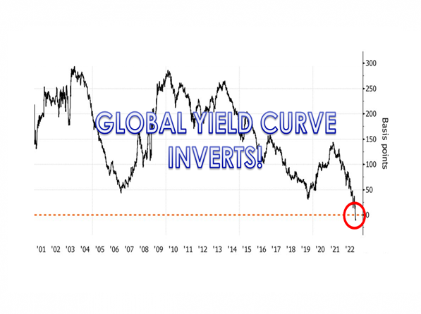
COVER
Global bonds have joined US peers in signaling a recession, with a gauge measuring the worldwide yield curve inverting for the first time in at least two decades.
The average yield on sovereign debt maturing in 10 years or more has fallen below that of securities due in one-to-three years, according the Bloomberg Global Aggregate bond sub-indexes.
That has never happened before based on data going back to the beginning of the millennium.
SLIDE 4
This is an important milestone that needs to be examined since the US Yield Curve is also inverted. This is without doubt a dependable signal that a recession is a strong possibility.
When, how long, the depth and impact are all open to interpretation. We will try and put this into better context in this video session.
As such we will cover the items outlined here.
SLIDE 5
I want to place the global & US yield curve inversions in context to other economic indicators because we feel it is telling us more than most yet realize.
SLIDE 6
To do that I want to share with you the context we at MATASII.com place the yield curve. We call it the MATASII Economic Monitor because there are different views that professionals have depending on which camp they are in.
These camps also place differing emphasize on other supporting indicators as shown here. We have simplified this chart to include three other indicators:
- The Purchasing Managers Index
- The Unemployment Rate, and the
- Volatility Index or VIX
SLIDE 7
First, let’s talk about the US Yield Curve Inversion. There are many duration ratios that are considered. I am showing here the 10Y US Treasury Note minus the two year Bill.
Since 1980 we can see we have had 6 instances – the late 70’s, early 1980’s, 89, 99, 2008 and today. In every instance the inversions have preceded recessions shown here by the vertical grey bars.
The degree of the current yield curve inversion is already worse than any prior level going back to the two sustained inversion periods of the late 70’s and early 1980’s.
This doesn’t bode well for the potential duration of this inversion and recession duration.
SLIDE 8
Here we show the Global yield curve inversion for the same 10Y minus two year duration.
What is clearly evident is that it is a very rare instance to have a global yield curve inversion. The same as it is rate to have a global recession!
For the first time since at least 2000 (since Bloomberg's records began), the average yield on global sovereign debt maturing in 10 years or more has fallen below that of securities due in one-to-three years. I personally don’t recall a global yield curve inversion or a global recession during my entire career.
The IMF views historically global recessions occur over a cycle lasting between eight and ten years. Using their historical analysis the IMF terms global recessions as occurring when global per capita output growth was zero or negative. We are not there yet globally but we clearly have the all marks of this potentially occurring.
The take away here is that this is a serious development and should be viewed as a secular versus cyclical development.
Markets want to hear what they want to and discard what seems discordant. Financial markets are currently viewing all economic news as just another potential cyclical recession. We differ on that view!
SLIDE 9
What we see is that the front-end Treasuries don’t seem to give one the impression that they are quite priced for a terminal rate that may be higher than 5%?
Analysis shows that the differential between front-end yields and the Fed’s benchmark has always been positive before the conclusion of monetary tightening. And the Fed hasn’t been able to conclude its tightening cycle before the real funds rates is significantly positive -- and at the moment we are at around -1%.
We are highly likely to have much further to go than the market is presently thinking.
SLIDE 10
.. And that may be the central problem in the market!
Something we have always given consideration to and is popular in the bond market is what is called the Coppock Curve. It stems from work that Coppock did regarding the 11-14 month grieving process. Coppock concluded that the process of getting over a big loss on an investment might work the same way in terms of human psychology, and so he incorporated that timeframe into his indicator. What he wanted was a way to identify the really important long-term buying opportunities.
“This indicator has a remarkable 100+ year track record when it comes to signaling the start of a new bull market for stocks. And it is one of the few technical tools that would have kept anxious investors from stepping prematurely into the middle of the 1929-1932 record stock market declines…
Coppock Guide buy signals are marked by upturns from readings at or below zero. And often the more negative the reading when it turns upward, the more impressive the profits ahead. Using these guidelines has confirmed practically every major bull market run since 1920, with just two false signals given in 1941 and November 2001.”
While it is true that timing stock market peaks may be more difficult, once a bear market has begun, investors using the Coppock Curve at almost any point in time over the past century would have largely been successful in timing major stock market bottoms.
It is noteworthy that the Coppock Curve broke below the zero line back in September.
Moreover, it is unlikely to form a bottom and curl higher for at least a few more months.
Even if the current rally were to continue higher the Coppock Curve likely wouldn’t itself reverse higher before February. And if the rally rolls over once again, it will push the upturn in the indicator out even further.
In short, the grieving process for Mr. Market (over the loss of massive monetary stimulus) may take a bit longer than bullish investors today might hope.
SLIDE 11
This is something to consider as we get into the MATASII Economic Indicator.
SLIDE 12
Let’s start with how the Yield Curve is overlaying with Unemployment levels since this is presently really confusing the markets. The Federal Reserve and Treasury Secretary Janet Yellen presently say they don’t see a recession because the labor market is simply too strong! Their view is there are more jobs that people looking for work and employers can’t find workers.
We need to remember that the Fed’s mandate is twofold: 1- Price Stability and 2- Full employment!
SLIDE 13
I shown here the Yield Curve versus the governments reported Unemployment Rate.
A couple of observations:
- We can see in blue the yield curve is inverted and below the dotted inversion level. I am using the Yield Curve as represented by the 10Y US Treasury Yield less the controlled Fed Funds Rate which relates to the terminal rate projection I showed earlier.
- I show a horizontal orange bar that represents lower end historical unemployment levels. We experienced those levels in the late 50’s, early 70’s, early 90’s, the dotcom era and currently. These by historical measures are historically almost as good as it ever gets.
- We also see that often high and lows between Unemployment and the Yield Curve overlap. They are not great timing tools but certainly spot major potential trend changes.
- We are likely about to see Unemployment surge. This matches the exhaustive list of announced layoffs we published in a recent newsletter.
SLIDE 14
Here I overlay the stock market as represented by the S&P 500.
- In yellow boxes I highlight the Dotcom Bubble implosion and the 2008 Financial Crisis.
- We see here that a falling market was marketed with surges in Unemployment and Yield Curve Inversions.
- We have seen neither Unemployment surge yet nor a drop in the markets that would even begin to reflect the extraordinary levels are they coming from.
- The yield curve inversion could get worse as markets fall further with Unemployment increasing.
- I have also drawn in a horizontal grey bar that marks the higher end of yields. This matches the new Financial Repression targets we laid out in the December UnderTheLens video entitled: Financial Repression III.
SLIDE 15
Nominal yields on 10- and 30-year Treasuries slumped below the lower end of the Federal Reserve’s benchmark rate this month for the first time in the current economic cycle.
That occurrence -- a dipstick of fear in the market -- has traditionally presaged a shrinking labor market in data going back more than five decades.
SLIDE 16
According to supporting data from the Atlanta Fed, the labor market has not broken down yet. This reflects our layoff announcement tracking in our newsletter.
The basis for this is that Y-o-Y wage growth has only slightly deteriorated from a major long term peak.
There is a major disconnect or an artificial hiring bubble about to burst.
SLIDE 17
We need to watch wage growth closely to see if and how fast it falls. Without it the Fed’s actions and elevated markets are likely to persist well into early 2023.
SLIDE 18
Business Managers look at the yield curve interest rates and input costs as important indicators of profit drivers.
SLIDE 19
We show here the Chicago Purchasing Managers Index versus the same yield curve.
What we see here is:
- There is a strong correlation between the two with the yield curve leading,
- The peaks and troughs are often relatively close in amplitude ,
- The 50 level which separates PMI expansion from contraction centers itself around the yield curve inversion point shown by the dashed line. It often reverses at this point as does the fed controlled Yield Curve using the Fed Funds rate versus the 10Y US Treasury Note,
- The green bar at the bottom identifies major contraction lows. Lows we witnessed during Covid-19, the 2008 Financial Crisis and Dotcom Bubble.
- The PMI is already at lows we have seldom seen over the last seven decades. This degree suggests at least a a couple of years is required before we should expect to see the 50 level of expansion broached again.
SLIDE 20
If we again overlay the S&P 500 we see:
- When we highlight the Dotcom Bubble and 2008 Financial Crisis with yellow boxes we had major yield curve lows of 50-60 negative basis points,
- There is a strong chance that the Yield Curve may repeat this or worsen further, taking the PMI contraction lower with the S&P 500 price in black having plenty of room to head much lower. In fact we may be only half way to initial price support in the area of 2800-3200. These are levels we have discussed in other videos and newsletters.
SLIDE 21
If we now look at the relationship between the PMI and Unemployment rate …
SLIDE 22
… and keep our benchmark Yield Curve and S&P 500 reference levels …
SLIDE 23
We arrive at this chart. It is therefore a little busy but highlights the following:
- Unemployment is likely to soon rise significantly, prices falling to lower levels as the yield curve inversion begins bottoming along with PMI contraction.
- The rates of decline already experienced in PMI, Yield Curve flattening and Price suggests it will take an 18-24 month period (or longer) to begin any sort of major retracements.
- We are in the midst of a secular shift in the US and Global Economy.
As we will show a little later there are some reasons to still be optimistic over the next 14-18 months.
SLIDE 24
There are other technical indicators that give further evidence to what is likely to unfold.
SLIDE 25
One such pointer is the VIX shown here in the center. The VIX is a measure of volatility in addition to a measure of Risk. Through the Black-Scholes model it is also the basis for option pricing.
SLIDE 26
With todays markets being highly controlled by Gamma traders and underpinned by a $1.4 Quadrillion derivative complex it is something that needs consideration.
But exactly how? The VIX is notoriously volatile as its name alone implies.
SLIDE 27
A way we have found is to consider the VIX in a longer term context.
Shown here is the VIX on a monthly basis shown over a 30 year period.
What stands out is:
- The VIX follows longer term trends on its downside. It is volatile upward but its bottoms are contained by lower support lines.
- We see these support trend lines in dashed red lines prior to the Dotcom collapse and the 2008 Financial Crisis Collapse. When that trend is violated major market drops ensue.
- On the right you can see we are at presently at exactly such a test point.
SLIDE 28
I have connected the dotted VIV trend lines where they cross the S&P 500 and we see the dotted plot line aligns at exactly our current position.
This gives further indications that we are likely near another major inflection point.
None of this in itself is conclusive timing evidence. But we are getting there!
SLIDE 29
A signal based on the manufacturing indices compiled by the regional Fed banks indicates a recession next year.
However, positive cyclical equity data suggests one is not imminent, while stock indices MOST IMPORTANTLY are not yet fully pricing one in!
Next year is set to be dominated by when the US will go into a recession, thus the more ways this question can be answered, the better.
Shown here is one simple recession model based on the percentage of the regional Fed surveys in contraction. The signal triggers when 100% of the indices are in that state.
As we can see it does a pretty good job. It triggered for every recession going back to 1970, but it also gave two false positives, in the mid-1990s and 2015. It also suffers from triggering a little too late sometimes, although it did go off prior to the 1981 and 1990 recessions.
It triggered in October, so we will find out in the coming months if this is another correct signal.
SLIDE 30
Still, this is only one signal, and the best way to gauge recession risk is by combining several different indicators that approach the question from different angles.
One such other reliable signal is the Philadelphia Fed State Diffusion Indicator. It measures the net number of states whose coincident data are rising. After rebounding back to +68% in September, the recently-released October reading slumped to -4%. Every time it has hit that level, the US has subsequently gone into a recession.
SLIDE 31
Nevertheless, a recession is not imminent, based on the behavior of cyclical stocks (the “Druckenmiller Indicator”), along with other data, but one is looking very likely by the second half of next year.
It’s a case of when, not if, for a recession in 2023. Either way, though, equities have yet to fully price in this reality.
My take on this and why I showed these Recession indicators is too suggest that though the actual recession is likely out into Q2 2023, markets price with lead times of 6-8 months.
We should expect the markets to now begin to price in the coming recession since it is no longer a matter of IF. Markets price in the when through their lead times!
SLIDE 32
The stock market reflects the underlying economic activity over the long term. Personal consumption makes up roughly 70% of that activity. The consumer is more heavily leveraged than ever, making it doubtful they can become a significantly larger chunk of the economy. With savings low, income growth lagging inflation, and debt back at record levels, the fundamental capacity to re-leverage to similar extremes is no longer available.
Let’s also not forget the singular most important fact.
Following the two previous bear markets, the breakout of the markets in 2013 was NOT one based on organic economic fundamentals. Instead, it was from massive monetary interventions by Central Banks globally. All previous secular bull markets were a function of extreme under-valuations, washed-out financial markets, and falling interest rates.
Such is not the case currently.
“A secular market trend is a long-term trend which lasts 5 to 25 years and consists of a series of primary trends. A secular bear market consists of smaller bull markets and larger bear markets; a secular bull market consists of larger bull markets and smaller bear markets.”
SLIDE 33
The prevailing trend in a “secular bull” market is “bullish” or upward-moving. In a “secular bear,” the market tends to trend sideways with severe drawdowns and sharp rallies.
The chart shown here from Lance Roberts’ RealInvestmentAdvice.com, lays out the market action from 1871 to the present, with secular bull market cycles highlighted.
Notably, as an investor, only 5-periods are secular bull markets (where prices are increasing) over the last 150 years. Those five periods account for 100% of all the index gains. In other words, the outcome was disappointing if you invested on a buy-and-hold basis during any other period.
Three items drive secular bull markets:
- Valuation expansion,
- Earnings growth, and
- Falling interest rates.
The most prominent driver of secular returns is periods of valuation expansion and contractions.
SLIDE 34
Shown here is the history of secular market periods going back to 1871 using data from Dr. Robert Shiller.
You will notice that:
- Secular bull markets begin with CAPE valuations around 10x earnings or even less.
- Secular bear markets tend to start with valuations of 23-25x earnings or greater. (Over the long-term, valuations do matter.)
- Most notably, secular BEAR market periods are defined by near-zero returns during the valuation contraction process.
It is imperative to remember valuations are very predictive of long-term returns from the investment process.
However, they are horrible timing indicators. Because valuations, and fundamentals in general, take a long-time to play out in the markets, it is not surprising investors dismiss them during a secular bull market.
SLIDE 35
As we pointed out, what drives long-term secular “bear” markets is “valuation contraction.”
Such is driven by investor re-evaluation of earning power by companies due to changes in:
- Interest rates,
- Inflation, and, most importantly,
- Prospects for economic growth.
Unfortunately, forward prospects for more robust economic growth remain challenging due to high debt levels, which is a deflationary headwind.
SLIDE 36
The problem of overvaluation in a slow-growth economic environment is problematic.
The massive surge in earnings during the pandemic-driven shutdown is unsustainable as the economy normalizes. Massive stimulus programs, combined with enormous unemployment, led to surging profits that are not replicable in the future.
As shown, earnings are one of the most mean-reverting data series in existence, and ultimately if earnings don’t revert, capitalism is no longer functioning correctly.
The most obvious indication that a secular bear market may be upon us is the deviation of earnings from their underlying growth trend. Earnings cannot, over the long term, outgrow the economy. Such is because it is economic activity that creates corporate revenues. The eventual reversion in economic growth and corporate earnings suggests that asset prices are vulnerable to a much more significant reprising to reflect future economic realities.
SLIDE 37
There is little doubt things will turn out differently than we currently envisage, so keep a close eye on the MATASII charts, newsletters and videos as we adjust for the realities of what is sure to come.
- Expect monetary, fiscal and public policies to become extreme and never previously used.
- Expect geo-political conflict outcomes to be market moving,
- Expect unprecedented market volatility as even the professionals are continuously blindsided.
It won’t be easy but there will be a lot of money both made and lost.
When we combine what we have been discussing in this video, along with our other videos and newsletters we arrive at our best guess to currently look something like the following.
SLIDE 38
We have now put in the right shoulders of compound Head and Shoulders topping pattern that we have been watching unfold for two years.
We have also now completed the expected rally to the upper descending Bear market trend line we have been showing throughout 2022.
SLIDE 39
We should now begin to complete the second part of our predicted Elliot Wave Double Combo Zigzag pattern down to the lower side of the long term black trend channel that started after the 2008 Financial Crisis and shown in the upper right of this chart.
We are going lower, before this Bear Market leg is over. We will then face a major market retracement in the latter half of 2023 that is likely to move us back close to the upper black trend channel.
SLIDE 40
The coming selloff as we said earlier should be triggered by the pricing in of the 2023 recession.
SLIDE 41
During this stage we are likely to finally see the public capitulate by the selling of their Passive ETF holdings. If this occurs we could easily overshoot our 3000-3300 S&P 500 targets and our long held 3270 target.
SLIDE 42
We need to remember we are in an era of stagnation that began with the Dotcom Bubble bursting. We will likely enter an 18-24 month period of fairly significant volatility and cross currents.
That period will end as the Beta Drought Decade unfolds in the form of the Great Stagnation.
SLIDE 43
This 18-24 month period is likely to take the form of a large ABCDE consolidation triangle (shown to the left of the large black “B: labeling) with major ups & downs as global geo-political cross-currents and elements of Financial Repression III play out.
The “C” wave that will follow the completion of the “B” consolidation wave will likely equal the downward “A” wave we have already experienced. The long term technical’s currently suggest a final leg upward after we complete the drop to “C”.
SLIDE 44
That upward Bull Market lift will likely take some form possibly looking like this. We may not get this high, nor even a test of prior highs, but we will find the top of the ABCDE consolidation triangle in second half 2023. If this parabolic pattern which has served us well for a few years now continues to hold, the upper lift could go higher and take longer than we currently expect.
SLIDE 45
If those actions give us a double top then the unfolding pattern will emerge as shown here.
SLIDE 46
Most importantly to recognize is that all this market action will result in significant erosion in the US standard of living! The world is not coming to an end.
The goal here is the reduction in standards of living of over indebted western economies and the reduction of debt through Financial Repression III.
SLIDE 47
As I always remind you in these videos, remember politicians and Central Banks will print the money to solve any and all problems, until such time as no one will take the money or it is of no value.
That day is still in the future so take advantage of the opportunities as they currently exist.
Investing is always easier when you know with relative certainty how the powers to be will react. Your chances of success go up dramatically.
The powers to be are now effectively trapped by policies of fiat currencies, unsound money, political polarization and global policy paralysis.
SLIDE 48
I would like take a moment as a reminder:
DO NO NOT TRADE FROM ANY OF THESE SLIDES - they are for educational and discussion purposes ONLY.
As negative as these comments often are, there has seldom been a better time for investing. However, it requires careful analysis and not following what have traditionally been the true and tried approaches.
Do your reading and make sure you have a knowledgeable and well informed financial advisor.
So until we talk again, may 2022 turn out to be an outstanding investment year for you and your family.
Thank you for listening.